Like A Good Neighbor
Simplifying Insurance, One Design at a Time
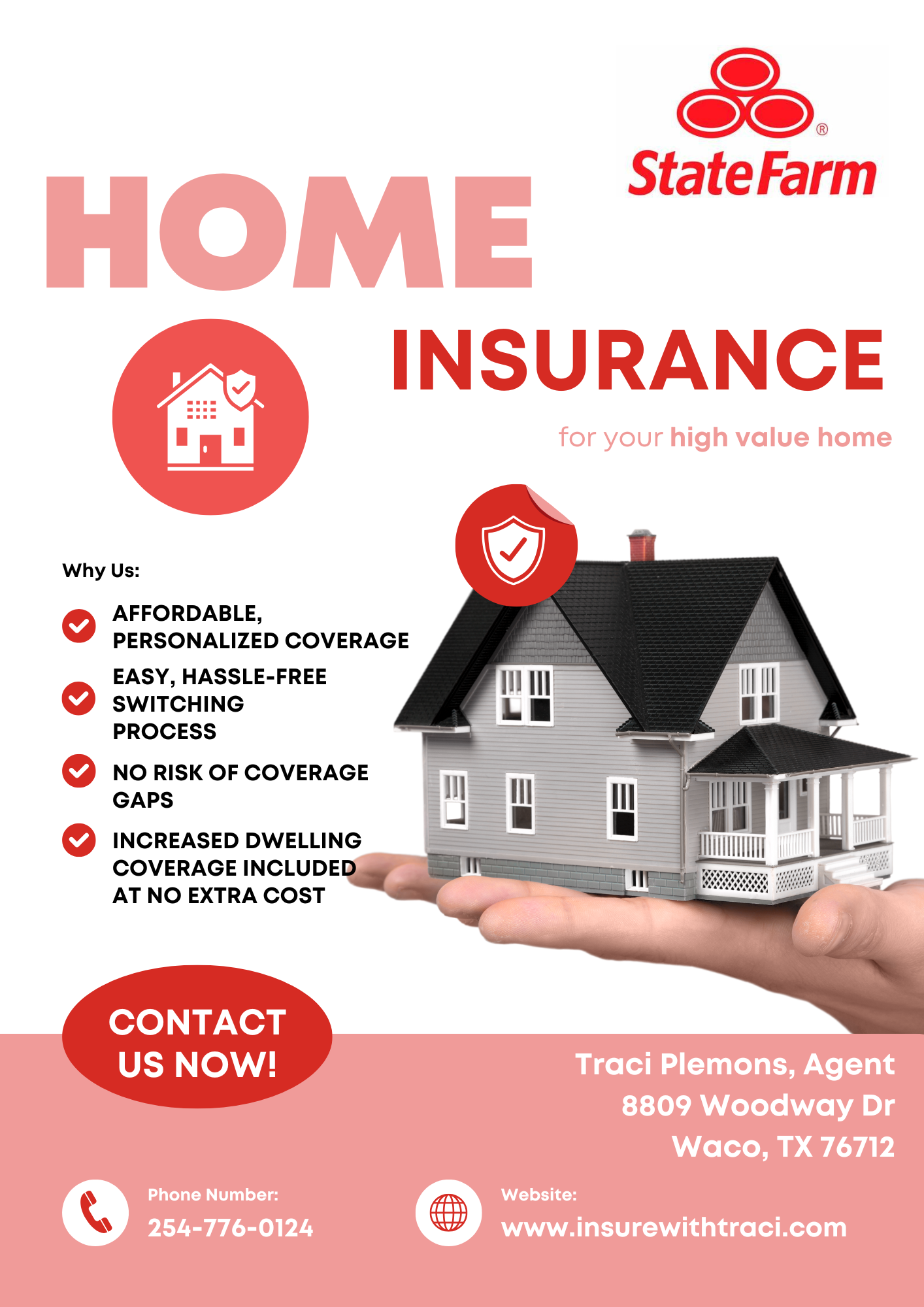
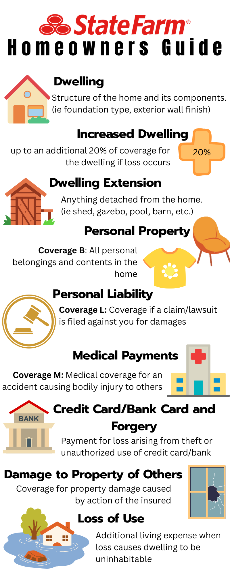
I created a series of Canva-generated graphics to help clients better understand the breakdown of future insurance quotes. These are emailed to clients or printed in office to provide to those who come in and chat with our agents face-to-face.
Designing Clarity: Making Insurance Easy to Understand
Overview:
Insurance can feel overwhelming—especially when it comes to interpreting quotes and coverages. To bridge this gap, I developed a series of clear, user-friendly Canva designs aimed at educating clients on their future policy options.
Objective:
Help current and potential clients easily interpret quote details
Break down complex insurance terms into digestible visuals
Increase trust and transparency through educational content
Design Strategy:
Used Canva to create clean, brand-aligned graphics with icons, simple language, and visual hierarchy
Focused on home, auto, and life quote breakdowns with clear callouts (e.g., deductible vs premium, what’s covered, etc.)
Included a consistent design series to create a recognizable educational campaign
Execution:
Scheduled and published social media posts through Hootsuite for optimal timing and consistency
Monitored engagement and refined designs based on client questions and feedback
Integrated posts into a larger Facebook content calendar for our State Farm office
Tools Used:
Canva: Design and layout
Hootsuite: Social media scheduling and analytics
Facebook: Platform for client education and lead interaction
Impact:
Improved client confidence during the quoting process
Reduced follow-up questions about policy details
Strengthened our office’s online presence as a helpful, informative resource


